 121 Technology designed websites
 Responsive web sites
 Photography from 121 Technology
 Web Hosting
  Website Design
  121 website builder template
  Domain name registration
 Responsive web sites
Responsive web design. Websites designed by 121 Technology Ltd are mobile friendly and look good on any device
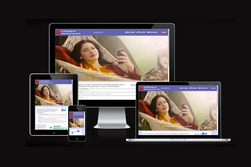
With more and more people using their tablets or smartphones to surf the Internet, it's important that your site looks at its best to these visitors. Sites that rely on 'pinch to zoom', because the content has been scaled down to suit the screen, look old-fashoined and uninviting - the last thing a website wants to be. You need to entice people in, not encourage them to leave!
The buzz word in web design is 'responsive'. Basically, it means that the website responds differently according to which device is being used to view the site - for example a large PC screen, laptop, tablet or smartphone will show content in slightly different places, without making the text so small you can't read it.
Back in 2015, Google started to rank 'mobile-friendly' sites higher in search results (done on a mobile) higher than non-mobile friendly. As about half of all searches are done on mobile phones - can you afford for your website not to be mobile friendly? Despite this being over 10 years ago, when you encounter a site that isn't mobile-friendly, it's very off-putting.
If you're viewing this on a pc or laptop, drag the window narrower and you'll see the effect. Content is moved around to match the screen width.
The picture above shows how 121 Technology's home page looked on different devices.
Firefox users can get the 'web developer' plugin, then select 'View Responsive Layouts'.
You can test your own site by following this link (or this one).